

Colour does more than just decorate a room. It shapes how a space feels to be in, even if the effect is subtle rather than dramatic in most everyday settings.
Paint psychology draws on design experience and some research to guide colour choices, but individual reactions to colour can still vary widely.
Understanding general patterns helps inform decisions, without treating any single colour as a guaranteed fix for mood or focus.
Design practice has used colour this way for decades, long before formal research caught up with many of the claims commonly made in popular articles and marketing.
The Impact of Colour on Everyday Environments
Colour theory in architectural design examines how colour, light, and space interact rather than treating colour as a standalone decision.
The same shade can read differently depending on natural light, room size, and what’s placed next to it.
A colour that feels calming in a bright, north-facing room can feel flat or dull in a darker, south-facing space, even when using the same tin of paint.
Designing Corporate Hubs: Using Colour to Support Focus
Maximising commercial workplace productivity through colour is a common design goal, but the evidence behind specific colour claims is genuinely mixed.
Researchers in this field generally agree that colour has some influence on mood, but caution against treating any single hue as a scientifically proven productivity switch in itself.
Blues and Aquas for Steady, Focused Task Work
Blues and aquas are often chosen for spaces involving repetitive or detail-focused work, since many people associate them with a calmer, more settled feeling.
This association is common in design practice, though it’s based more on widely shared perception than tightly controlled experimental evidence from the research literature.
Greens for Reducing Eye Strain and Easing Tension
Green is commonly used near screens or during longer work sessions, partly because many people find it visually restful compared to brighter tones.
Its association with nature is often cited as one reason it feels less demanding on the eyes over an extended period of screen use.
Crafting Residential Sanctuaries: Everyday Comfort at Home
Living rooms and shared spaces often lean towards warm neutrals and soft terracotta tones, which read as inviting rather than clinical.
These tones work well with a wide range of furniture and lighting, which is part of why they remain popular choices for home communal areas.
Adding a small amount of contrast, such as a darker cushion or rug, generally keeps a warm neutral palette from feeling flat or one-dimensional.
Relaxing bedroom environment palettes commonly favour muted lavenders and cool sages, chosen for a settled, low-stimulation feel rather than anything bold.
Bright, high-contrast colours are generally avoided in bedrooms, as they can feel stimulating in spaces primarily meant for winding down and resting.
The Pitfalls of High-Intensity Monochromatic Formats
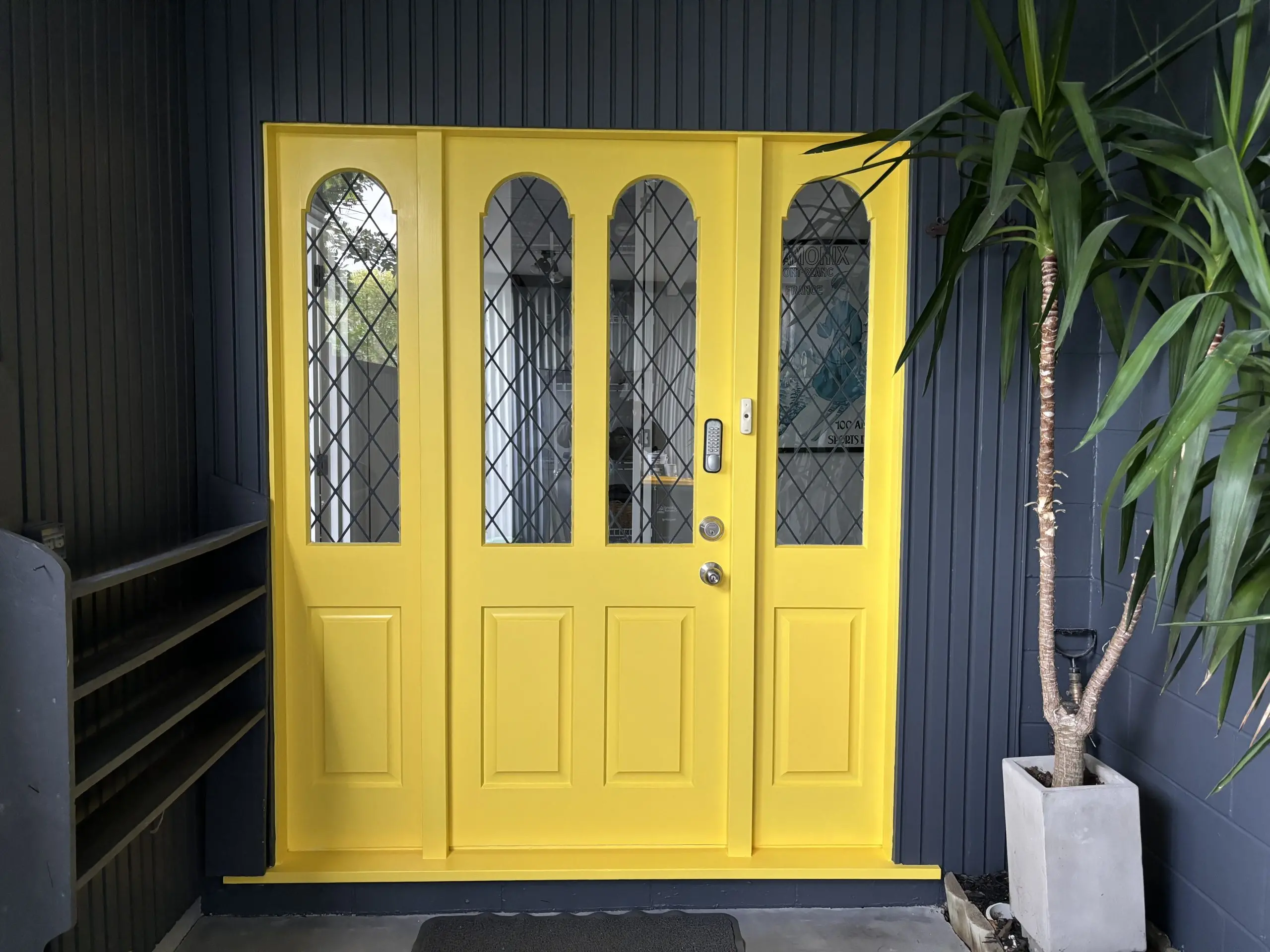
Strong reds and hot yellows used throughout an entire room, rather than as an accent, can feel overwhelming for some people over long periods.
These colours work better in smaller doses, such as on a feature wall or in soft furnishings, rather than covering every surface in the room.
Stark, clinical white throughout a whole space can also feel cold or sterile, particularly without any warmer materials or textures to soften it.
Adding timber, textiles, or plants alongside a white palette generally softens this effect without altering the wall colour throughout the room.
Maximising Apparent Room Scale via Contrast Calibration
Visual spatial manipulation through colour includes using lighter tones to make a room feel larger or contrast to define a smaller, cosier zone.
Darker tones on a single wall, rather than the whole room, can add depth without making the space feel noticeably smaller or heavier overall.
For homeowners considering a full repaint, painters in North Shore, Auckland, can advise on colour placement and practical application.
Frequently Asked Questions
A few questions people often ask about colour choices for a space.
Which specific colour undertones work best to stimulate creativity in design firm brainstorming rooms?
Warmer, more energetic tones, such as soft oranges or yellows, are commonly chosen for brainstorming spaces, though creativity depends on far more than just the colour of the walls.
Can the colour palette applied to home dining walls directly impact human appetite and meal enjoyment?
Warmer tones are often associated with appetite and sociability in dining spaces, though this connection is more rooted in long-standing design tradition than in strong scientific evidence.
How should I pick accent wall colours to prevent a small office from feeling visually claustrophobic?
Lighter accent tones, paired with good lighting, tend to keep a small room feeling open, while very dark accents can make it feel more enclosed and cramped.
Do matte finishes reflect colour light rays differently than high-gloss coatings in low-light environments?
Yes. Matte finishes absorb more light and appear duller in low light, while gloss finishes reflect more light and can look noticeably brighter in the same room.