

Walk into a freshly painted room, and you feel it before you can explain why, because colour shapes mood, light, and how a space is used long before the furniture arrives. It is often the fastest and most affordable change a home can make.
Understanding paint and design together helps you move beyond simply picking a favourite colour from a tiny swatch. Here’s how to use colour, finish, and placement to make every room feel intentional.
Why Paint Is the Most Powerful Design Tool
Paint changes everything it touches, from the way light bounces around a room to how big, warm, or calm the space feels. That is why transforming interiors with paint delivers such a large visual impact for a modest investment.
Unlike furniture or flooring, paint can be changed quickly as your taste evolves, and a skilled painter can deliver a crisp, lasting finish. Experienced interior painting services in North Shore can help you plan colours and prepare surfaces well.
Understanding Colour Psychology in Interior Spaces
Studying paint colour psychology helps you match a room’s mood with its intended purpose. Soft blues and greens tend to feel calming, warm neutrals feel welcoming, and strong reds or oranges can feel energising in the right doses.
Colour responses are personal and cultural, so treat these associations as a guide, not a rule. Test samples on your walls and view them in morning, afternoon, and evening light before committing to a full coat.
Choosing Paint Finishes for Different Rooms
The finish affects how a colour looks and how well a surface copes with daily life, so match each room with the right sheen:
- Matt: ceilings and low-traffic bedrooms, where a soft, even look hides imperfections
- Low sheen: living areas and hallways that need gentle wipeability
- Satin or semi-gloss: kitchens, bathrooms, doors, and trim
Higher sheens reflect more light and show surface flaws more clearly, so good preparation matters most with glossier finishes in any room.
Using Paint to Create the Illusion of Space
Light, cool colours tend to recede, making walls feel further away, and rooms feel larger and airier. Painting the ceiling a lighter shade than the walls can also draw the eye upward and add a sense of height.
Using one colour across walls and trim creates a smooth backdrop that blurs boundaries, while deep colours can make a large room feel cosier. Good natural light helps any colour look its best, so consider your windows when making your choice.
Accent Walls and Feature Colour Techniques
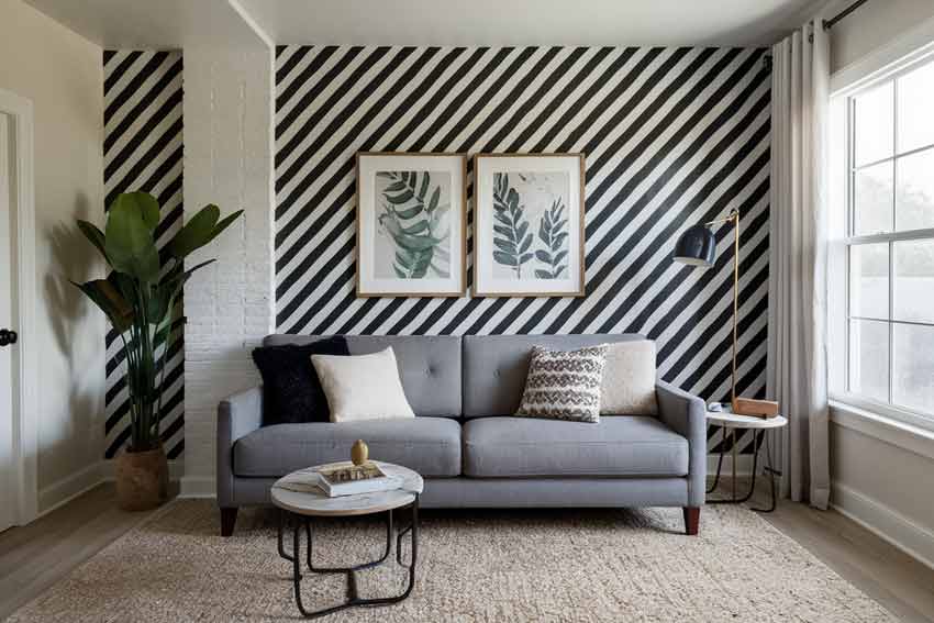
Among the most popular interior paint ideas, an accent wall adds depth and a focal point without overwhelming the room. Choose the wall your eye naturally goes to, such as behind a bed or sofa, or a feature fireplace.
Other feature techniques include painting a door in a bold shade, colour-blocking an alcove, or using a darker tone on built-in shelving. Keep the rest of the room calm so the feature colour stands out.
Coordinating Paint With Furniture and Décor
One of the best interior design paint tips is to start with what you already own. Pull two or three colours from your rug, artwork, or upholstery, and use them to guide the wall colour and your accent shades.
Balance is key, so pair bold furniture with quieter walls and let patterned soft furnishings sit against plain colours. Before buying, check your fabrics, flooring, and timber tones against paint samples in the actual room.
Trending Interior Paint Colours
Warm neutrals, soft greiges, and earthy tones such as olive and terracotta have been popular choices as homeowners look for calm, natural-feeling spaces. Deep blues and charcoal also add drama to dining rooms, studies, and powder rooms.
Trends come and go, so choose colours you will enjoy for years and use bolder trend shades in smaller doses, such as a single wall or piece of joinery, because timeless foundations make later updates easier.
Common Interior Painting Mistakes to Avoid
Skipping preparation is the biggest mistake, because dirty, damaged, or glossy surfaces stop paint from bonding properly. Rushing coats, ignoring ventilation, and choosing colours from a tiny swatch under shop lighting are other common traps that can spoil the finish.
In older homes, check for lead before sanding, because Health New Zealand notes that buildings painted before 1980 can have lead-based paint. Use wet methods and proper protection, or call a professional to handle the work safely.
Frequently Asked Questions
What paint finish works best for small rooms?
A matt or low-sheen finish usually suits small rooms, because it softens the walls and hides minor imperfections. Use satin or semi-gloss on trims and doors, where extra durability and a little reflection help.
Can paint make a room look bigger?
Yes, light, cool colours and a lighter ceiling can make a room feel more spacious. Using one colour across walls and trim also blurs edges, which helps small spaces feel less boxed in.
How do I choose a paint colour palette for my home?
Start with a colour you love in the room, then pick one main neutral, one supporting shade, and one accent. Test samples on the wall and check them against your furniture and flooring in different light.